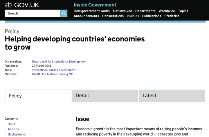
I’ve recently been embedded with the Inside Government team to work on understanding user behaviour through data analysis. One of my first tasks was to investigate the way that policies are being used and to identify any interesting or notable conclusions. Here's an example of the format of a policy:
The content explorer provides a very useful snapshot of how the policy content is performing. But I wanted to dig further down into the data.
At the time of the analysis, Inside Government featured approximately 200 policies. I started by examining usage of the format to provide some background context using our analytics package.
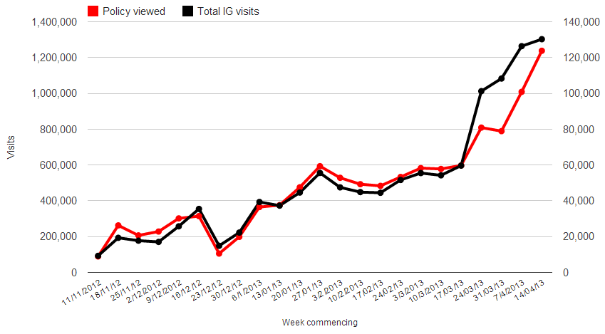
The black line in the graph below shows the weekly visits to Inside Government since it was launched. The red line, plotted on the right axis, shows visits in which at least one policy was viewed. Note the different scales on the two Y axes. Visits involving looking at a policy page make up around 10% of visits to Inside Government, and this has remained fairly consistent as more departments have moved to GOV.UK.
I next looked at the pageviews of policy pages in the first two weeks of April to get a sense of the popularity distribution. (Use this chart to get a feel for the distribution, rather than the individual data points!)
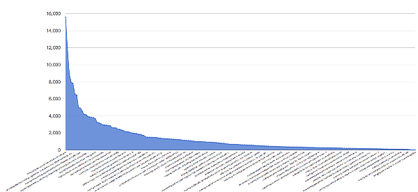
This shows that there are a few policies which are relatively very popular such as Increasing the use of low-carbon technologies and Reducing obesity and improving diet. The majority of policies got fewer than 2000 pageviews but this is not surprising as many of them are topical, such as Marking relevant national events and ceremonies, or specialist, like Managing freshwater fisheries.
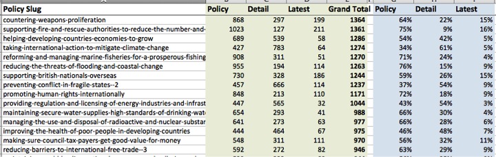
The majority of policies feature 3 tabs: 'Policy’, ‘Detail’ and ‘Latest’ and I broke down each 3-tabbed policy by the share of pageviews each of the tabs received.
From this I was able to calculate that on average the Policy tab received 57% of the pageviews. Next, I created a histogram with percentage 'buckets' showing how many policies were categorised in each.
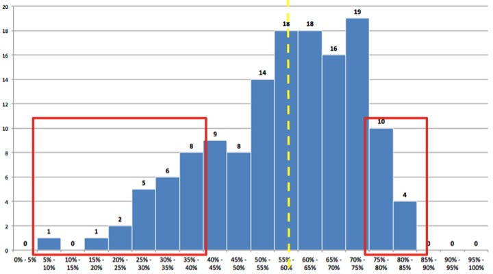
This shows, for example, that there were 14 policies in which the Policy tab share was between 50--55%. The broken yellow line shows the average, and outlying areas have been highlighted in red. On the left side are policies in which the main Policy tab was infrequently viewed, such as Making it easier to trade. On the right side are policies in which users hardly looked at the Detail or Latest tabs, such as Adapting to climate change.
The underlying data for all the policies have been shared with Inside Government content designers to analyse further how users are coming to these policy pages and to identify where improvements can be made.
This analysis is part of our work to understand how users are engaging with content since we completed the transition of the ministerial departments to GOV.UK. Next we will introduce additional factors such as the distribution of time spent on pages, the depth of scrolling and where links have been clicked on a page; all of which will provide a deeper understanding of user behaviour, and pinpoint where performance is good or where improvements are required.
