One of the GDS design principles is 'design with data'. Front end developers need to know what the current browser landscape looks like and in which browsers they should be regularly testing new features.
To help us do that, I created a tool, which extracts statistics from analytics and displays them as a nice line graph or as a data table.
When I used the tool I expected to see a collection of straight lines. What I actually saw had me scratching my head and wanting to delve further into the data. I thought I'd share some of the more interesting trends.
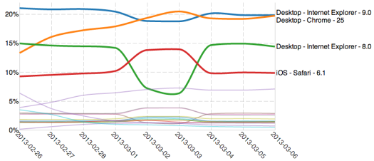
What you can see here is a graph of 1 week's worth of traffic to the whole of GOV.UK. I've highlighted the interesting results. This could be any week of traffic - I've compared several and they all follow the same trend. Traffic from Internet Explorer browsers all dip at the weekend and traffic from all other browsers, most notably Chrome and iOS Safari, increase. So for 2 days a week, every week, Google Chrome is the most used browser on GOV.UK. We think this is due to people accessing the site during the week from work or publicly available machines, for example in libraries. We will continue to look into this.
The other interesting trends looks like this:
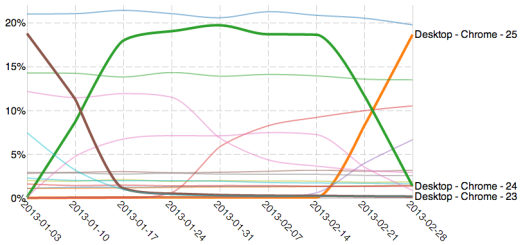
What you can see here is the effect of the 'auto-updater' built into Chrome. This lets Google update all of its users to the latest version of the browser without users knowing. On or around 23 February 2013 Google hit the button to auto-update all of their users to the latest version ie Chrome 25. Within a week you can see most of the visits to GOV.UK from Chrome were from the new version, now that's a pretty impressive uptake. If you look lower in the graph you can just about see a similar trend with the Firefox updater.
These are just a couple of interesting things you can see from our stats. You can access this tool via your own Google Analytics account to see what the browser landscape looks like for your users. Feel free to use this browser matrix tool on your stats and share with us any interesting trends you find.

18 comments
Comment by Benyamin posted on
Interesting read, I too have so many tabs open and to be honest I can't remember the last time I closed my browser!
Comment by Browser usage: could UK government finally be rid of IE6? | Digital democracy, news, thinking, tips & tricks posted on
[...] be stuck with a slightly out-of-date standard-issue browser. Incidentally, Edd at GDS made some interesting observations about this same phenomenon last [...]
Comment by David Read posted on
Interesting data snapshot and conclusions. Lots in common with the data.gov.uk dashboard, launched back in February: http://data.gov.uk/blog/site-usage
Comment by Rounded Corners 408 — Hashes and spies | Labnotes posted on
[...] This might explain why we don’t see people upgrading from IE 8 to 9, and from 9 to 10, in any significant [...]
Comment by smarthomeman posted on
Very cool tool... now what we need is ability to group auto-updating platforms into a single line, since like me presumably most developers just target/test latest versions of such browsers... Then, I dream of a foldable hierarchy with ability to turn on/off any parts of the tree... I hope more developers pile in on this project. 🙂
Comment by Chrome is kicking IE out of our homes, suggests government stats ← SFH posted on
[...] an interesting blog post, Edd Sowden, a developer on the gov.uk sites, shows off a graph that shows that those coming into the official government sites through IE declines [...]
Comment by Kevin posted on
We also see browser dips at the weekends, and mobile usage is often higher too.
Those of us who can't afford a GDS developer to get this information into line graphs - can view it inside google analytics using motion charts.
(https://support.google.com/analytics/bin/answer.py?hl=en&answer=1010059&topic=1010058&rd=1)
You just go to browser/os and click on the little bubbles on the right - visits / time shows these graphs.
Comment by edds posted on
Kevin, you don't need to be able to afford a GDS developer. I have made the tool available for anyone to use with their own analytics data, you can find it here: http://edds.github.com/browser-matrix/
I hadn't played with the motion charts feature in Analytics, however upon looking it does seem that it doesn't quite give you as much information as my tool does. Unless it was hidden somewhere there was no obvious way to split browsers out by version? or device? One of the main motivations for me was actually just trying to get the data for unique browser/version/os split out in one table. This is incredibly hard to do in analytics but give you a much better understanding of absolute percents of visits and compare mobile browsers to desktop browsers better.
Comment by Chrome is kicking IE out of our homes, suggests government stats | allcom.se posted on
[...] an interesting blog post, Edd Sowden, a developer on the gov.uk sites, shows off a graph that shows that those coming into the official government sites through IE declines [...]
Comment by Chrome is kicking IE out of our homes, suggests government stats | Need2review posted on
[...] an interesting blog post, Edd Sowden, a developer on the gov.uk sites, shows off a graph that shows that those coming into the official government sites through IE declines [...]
Comment by Chrome: the rise and fall and rise again | Web Services posted on
[...] Sowden’s recently released browser matrix stats shows some fascinating patterns in usage for GOV.UK and the tool has also been made available on GitHub and for anyone to use. So what does it show [...]
Comment by David Bennett posted on
So a lot of people must leave their computers on and their browsers running for days on end?
Comment by Robert Gale posted on
I have so many tabs open it can sometimes be days or even weeks before I restart my browser.
Comment by James Offer (@joffley) posted on
Very interesting seeing the work v home browser differences. Does tablet access increase on the weekends also?
Comment by Steve posted on
You can see the iOS Safari peak in the first graph.
Comment by David Bennett posted on
If Chrome autoupdates, how come the decent and ascent lines aren't more or less vertical rather than taking a couple of days to come through?
Does it indicate that Google didn't roll it out for everyone at the same moment?
Comment by Edd Sowden posted on
David, the way the chrome auto-updater works is that it first downloads the new version of the browser in the background. It then waits for you to restart your browser, once you restart your browser you will then get the new version not the old one. The drop off taking a couple of days is just the time it takes for everyone to restart their browsers after they have downloaded the new version.
Comment by Ben posted on
The scale you've put on the graph indicates that cross overs actually take a couple of weeks (2013-02-14 -> 2013-02-28.) Furthermore (relatively unscientifically) the uptake curve is incredibly linear suggesting its not from a reasonably presumed probability distribution, and mostly likely is being throttled by Google. A wild guess would be that the do introduce new versions slowly to catch any possible bugs that may slip through.