Today we’ve released some quite big changes to GOV.UK designed to make it easier to find content, and to find your way around. I’m here to to give an overview of what’s changed and why, and then others in the team will go into more detail over the next few days.

It’s all about the navigation…
In the last few weeks the product team have been focused on helping users to find their way around GOV.UK. As I mentioned in my last post, user testing over the summer has shown that the style and presentation of the content goes down really well, but some users in every round have struggled to find what they needed – particularly if they weren’t confident about using search.
The original Beta site ensured the content was really well optimised for people coming in from search engines – which is where the majority of journeys do start - but didn’t cater so well for users who don’t search, or who want to explore a bit more around a subject when they arrived. Today’s release is intended to help fix that.
What’s new?
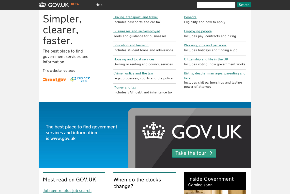
We have a bold new iteration of the home page, which gives much more prominence to a new set of categories. Testing showed that users tend to go to the home page to orientate themselves, and those that are less comfortable searching look for familiar terms and groupings and navigate to content through these. We’ve therefore included popular terms in both the names and descriptions of the new categories – and may well make further changes to these as we learn more about what works for users.

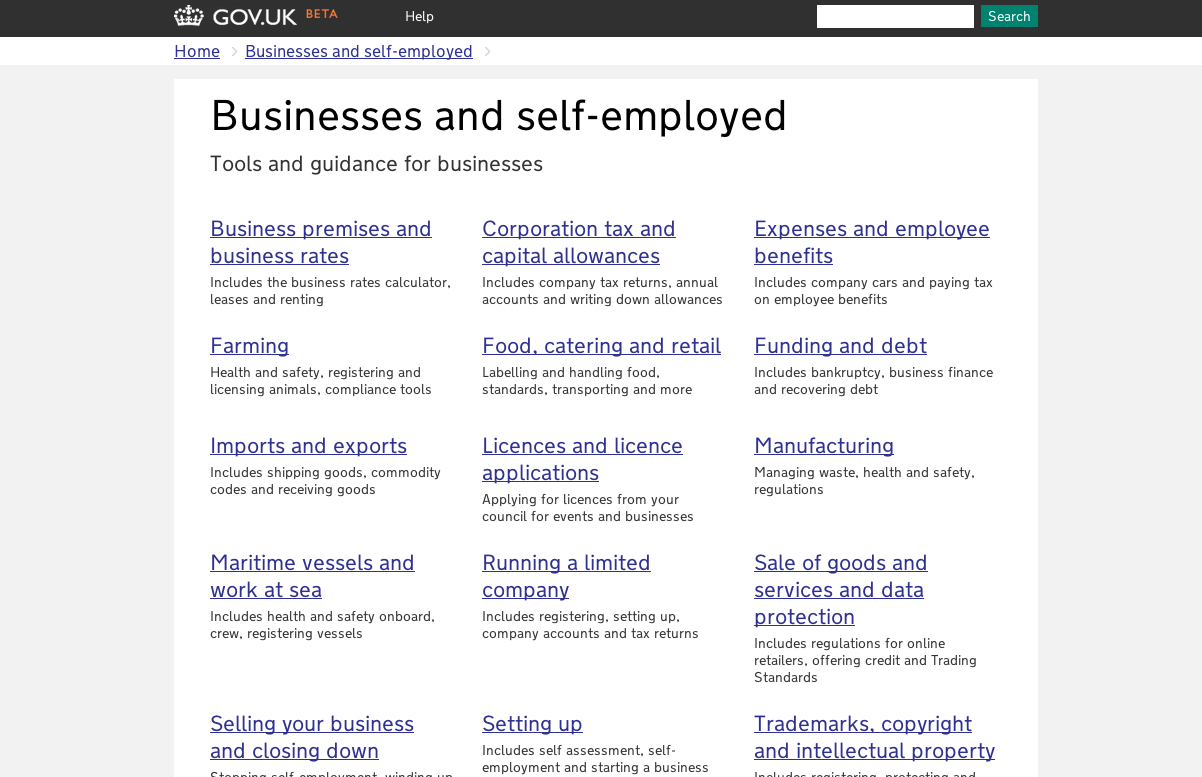
The new links on the home page take you through to improved category and sub-category pages. We’re in the process of allocating all our content to one or more sub-category, for example information about passports will soon appear in both Driving, transport, and travel and Citizenship and life in the UK. We’re keen not to duplicate content on GOV.UK, but instead make sure that relevant information can be discovered by more than one route, and in more than one context.
The new categories are also now displayed fully in the “crumb-trail” at the top of every page. This helps you know where you are, and makes it easier to go back up a level to broaden your view or look for something new. James will be explaining more about this in a separate post.
People who use search within GOV.UK to find content should also notice a big improvement from today. We’ve tightened up the algorithms that power our search, so users should now find the item they need high in the results. We’ve also moved results from the “detailed guidance” section of GOV.UK into their own tab, rather than hiding them away at the bottom of the results.
What next?
This is the last major iteration of GOV.UK before we come out of Beta – but there will be more improvements before then. As well as publishing new content most days we’re still categorising content and there are further tweaks to make to some of our formats, based on things we’ve learnt in the last round of testing.
Then, from October 17th, we can start to optimise GOV.UK based on large volumes of actual usage data, as well as continued user testing and feedback. That’s when the fun really starts! If you have any thoughts in the meantime, leave us a comment below.

9 comments
Comment by Huw Pritchard posted on
Screenshots in the blog post don't work in IE8, but if you click on them the pages themselves show fine
Comment by This week at GDS | Government Digital Service posted on
[...] The start of the week saw a few changes for GOV.UK, as the team released a new version of the homepage and browse pages, plus more content and tools throughout the site [...]
Comment by Testing GOV.UK with real users | Government Digital Service posted on
[...] On Tuesday, Sarah Prag wrote about some changes being made to GOV.UK based on feedback from usability testing. We wanted to share a few more details about what we’ve been doing; the methods we’re using, and the people we’ve been talking to in the run up to release. [...]
Comment by Fiona Graph posted on
I am glad you recognised that many users need a landing page - I'm one of them and I consider myself fairly adept at getting around websites. I do have some concerns about the new categories but hope to be able to discuss that with the mainstream team soon. Finally, I know this is picky - but shouldn't it be "Driving, transport and travel" with no comma before the "and"?
Comment by Why we’ve changed the homepage | Government Digital Service posted on
[...] Yesterday we released the latest version of the homepage. It’s significantly different from any of the other homepages we’ve released so far, but it’s the one that’s tested the best and the one we’re happiest with. [...]
Comment by Mikael Snaprud posted on
How about adding automatic completion of search terms to the search window?
Comment by Michael posted on
Good work!
I notice though that content is cut off at the top in Safari iOS5 (iPhone 3GS): http://db.tt/CZ5r1MHl
Comment by Ben (@FudgeApps) posted on
The new design looks good. The font doesn't work in Chrome in the Inside Government area on the homepage - http://twitpic.com/b0ef2b
The Driving category page is also not laid out very well. The height of the blue badge content is forcing the list items to wrap funnily.
There's also no space between the "Driving tests and learning to drive" heading and "Driving with a disability or a health condition" so they look as one - http://twitpic.com/b0eet7
Comment by John posted on
The homepage looks much better. It feels like a homepage now.
I'm glad that more work has been done on the categories.
I'd like to see those pages continue to develop to give a bit more prominence to the content that we know is most popular, eg on 'Driving, transport, and travel', I'd have thought that passports would be a more common need than Blue Badges. So that should really appear high to make sure it's above the fold.
Same applies when you get to a list of content. Some of that is much more likely to be what the user is looking for, so some way of featuring that at the top would be good.
But good improvements. Really looking forward to GOV.UK coming out of beta and iterating based on large volumes of users.