The third phase of the beta of GOV.UK
Today we release the third phase of the beta of GOV.UK - gov.uk/designprinciples - as set out in Tom Loosemore's blog post.
I'm proud to introduce the alpha release of the GDS Design Principles which the design and front-end team have been working hard to build over the last few weeks. These build on, and add to, our original seven digital principles.
I believe guidelines are more likely to be followed if they are simple, clear, helpful and easy to share. That's why this document is one simple HTML page and each principle has its own URL. Too many design guidelines are issued as huge PDFs that go unread.
We've organised this around 10 key principles. We believe that the work should do the talking, so underneath each of the principles there are examples of how we have applied that thinking in the work released so far.
As I mentioned in my first blog post, we are "Sketching out ideas we think might work, testing different solutions" so we have marked each of the examples with one of three tags:
Green / tried and tested - we're confident this idea works well.
Orange / likely to change - we're already considering changing this but we wanted to explain why we have made a particular decision.
Pink / experimental - we are trying this out and pushing it live to see how it works.
The original objective of these design principles was to "provide clear, consistent design, user-experience and brand clarity for those developing sites for the single GOV.UK domain". But they've grown slightly to cover many aspects of building digital services.
As with everything at GDS the first principle places the user at the centre. Let's be crystal clear about this - you can't design well unless you've put the effort into getting the brief right. If a bad digital service looks great, it's still a bad digital service. It's essential we are clear about what user need we are trying to meet
before we begin to design.
It's also essential we don't design alone. As James has mentioned we can no longer work in a way where designs are ‘thrown over the wall’ to developers.
Another key part of design at GDS is understanding that we are designing information, not just pushing pixels around a screen. Good, well thought-out information design will work well in any medium and on any screen. Good information design relates to content, not just visuals. That's why we've included a section on the GDS content principles.
We've also made these guidelines deliberately positive. Too many guidelines are a list of don'ts which never feels very encouraging.
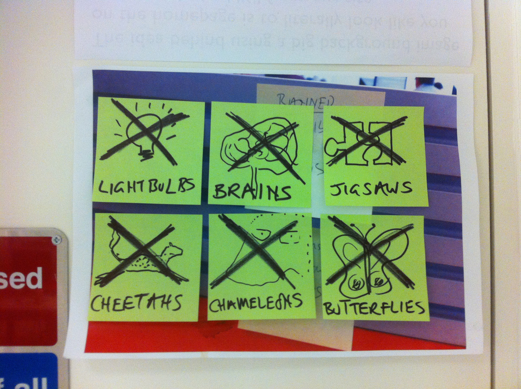
That said, we do have a 'banned list' at the end.
There's lots of stuff we haven't covered. That's because we haven't released a product where we've had to tackle that specific design challenge. For example Paul and Tim are currently working on a series of designs for transactions. We'll add that work to the guidelines when it's released.
These guidelines are intended for people building digital services for the GOV.UK domain. But we believe they will get better if we share them with a wider audience. Mostly they're common sense, but we hope you will agree with the thinking and, ultimately, we hope that they get shared in the same way people reference The Economist or The Guardian style guides. That's a big ambition, but there's no point in doing this unless we aim high.
As always we'd love your feedback. In particular we'd like to know what you think would be helpful for us to add. You can give feedback via email or GetSatisfaction.


10 comments
Comment by Sue Davis posted on
I'm writing a blog article for the EU about what content strategy can bring to government sites. Can I use the "Start with needs*" graphic on the blog?
Here's my first post in the series:
http://blogs.ec.europa.eu/waltzing_matilda/why-do-government-websites-need-a-content-strategy/
Comment by Jason posted on
Nice work. Do you guys need any help with design, graphic, WordPress, custom themes etc? Send any work over and I'll get it done no questions asked!
Comment by Brukerne er sjefen din « PRprat.no posted on
[...] under NEO2012-konferansen i april. Som britene selv forklarer, er sannsynligheten stor for at vi vil følge retningslinjer som tydelig er til hjelp for oss, som er enkle, tydelige og tilrettelagt for gjenbruk og deling. Omfattende PDF-dokumenter vil ingen [...]
Comment by Open Government with Principles | The Marketing Society posted on
[...] read this blog post Ben wrote explaining what they are doing too. It’s [...]
Comment by Dave posted on
This is excellent, thank you. Also, everything in Gill Sans makes it look splendidly government-y
Comment by Web Technologies | Design principles posted on
[...] their journey to produce a single government website. Their latest offering discusses the Government Digital Service Design Principles which are impressively simple, clear and succinct but also deep enough to be very useful. [...]
Comment by adactio posted on
This is great, Ben! I've added the design principles to this ongoing list I'm maintaining: http://principles.adactio.com/#organisations
Thanks for sharing them.
Comment by Diane Pearson posted on
I do hope the 'carry on' poster on your office wall is you being ironic? A 'design' concept done to death!
Comment by Thomas Punt posted on
This has been a wonderful exercise in co-operation and consultation.I will read it in detail later,
Comment by Design principles – Alpha | Government Digital Service posted on
[...] can now read more as we have released the alpha of our design principles. Rate this: Like this:LikeBe the first to like this post. From: GDS ← Putting APIs [...]