This continues a story I started on my own blog where I wrote about my previous job as Design Director at Wieden & Kennedy London. This is the one where I write about joining GDS as Head of Design. Later on I'll blog about the design in more detail and answer questions and stuff.
When I first met Tom Loosemore and Mike Bracken, they stressed the real change happening within Government. They talked about the huge opportunity GDS presented to change the way Government approaches 'digital'. That this was a real moment in time.

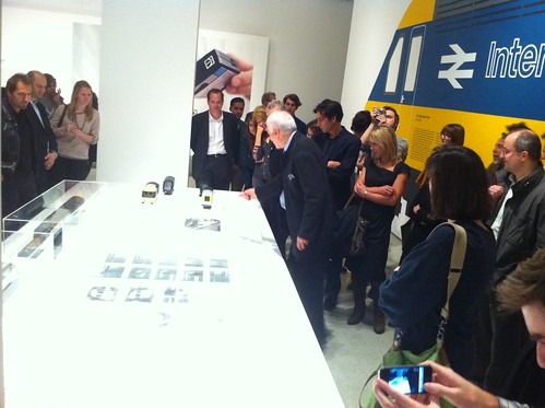
Picture borrowed from Paul Clarke
At the launch of GDS just before Christmas Francis Maude (our Minister) and Martha Lane Fox both spoke in the same way Tom and Mike had a few months earlier. This was really important for me. Important because if we are to achieve anything we all have to believe in the same mission. We all have to be heading on the same direction.
Britain has a great history of delivering big, public sector design projects. We have a rich heritage of design. Festival of Britain, Ministry of Information, Kenneth Grange, Design Research Unit. (More on that later.)
The design challenge here seems to be - don't avoid the obvious. Government websites are needs driven and what people want to do is get in, get what they want and then get out. Quickly.
What we'll be doing for the beta of GOV.UK won't be finished. The design will be in beta as much as the rest of the site. We won't get it right first time round. We'll be putting stakes in the ground. Sketching out ideas we think might work, testing different solutions and setting a course for where we want this thing to head. It's a huge, complicated task.
Simplicity will be valued
In many ways the problem is similar to problem Kinnear and Calvert faced when designing the road signs in the 60's. Before they came along Britain was littered with different signage systems all using different symbols, colours and typefaces which was at best confusing and at worst dangerous. With an exponential increase in vehicle traffic the government knew something had to be done. Kinnear and Calvert proposed one consistent system. One designed with the clarity of information as it's goal. From then on Britain had a solution that became the definitive standard and was copied around the world.
Sound familiar? Swap signage systems for websites. Swap vehicle traffic for online traffic. That's a challenge no designer could resist.
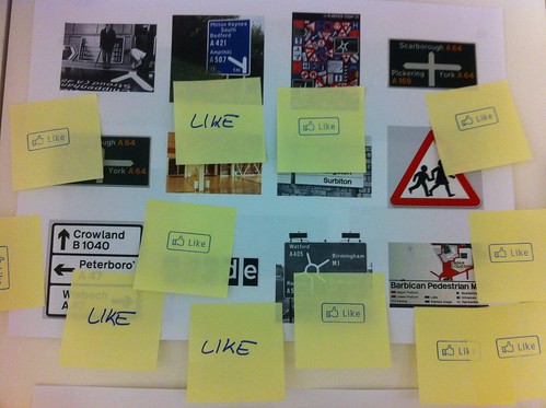
Picture borrowed from Russell Davies

21 comments
Comment by Designing for different devices | Government Digital Service posted on
[...] his post about designing GOV.UK, Ben Terrett said [...]
Comment by A few notes on typography | Government Digital Service posted on
[...] obviously a lovely symmetry to using the typeface from the road sign project as I’ve written before. Or, as Margaret puts it, “It is really exciting to see New Transport used for the first [...]
Comment by Present future history « Dubdog posted on
[...] and Jock Kinnear, the designers that transformed the road signage system in the UK in 1950s. Terrett says: “Before they [Kinnear and Calvert] came along Britain was littered with different signage [...]
Comment by Introducing the design principles alpha for GDS | Government Digital Service posted on
[...] I mentioned in my first blog post, we are “Sketching out ideas we think might work, testing different solutions” so we have marked each of the examples with one of three [...]
Comment by david wallis posted on
Please address the user interaction issue on the government job website, it is tediously inaccurate for anyone just wanting to examine the options available which most other job sites offer. But on the subject of the above post… fantastic news! in this day and age of knowledge through online sources as to any information let alone something as trivial as say, the government will be greatly received. Best o' luck
Comment by Blurring boundaries | Government Digital Service posted on
[...] vision of the team here at GDS is ambitious, as encapsulated by Ben Terrett’s post on design. I fully expect to to see the GOV.UK icons on tea towels in heritage shops in years to [...]
Comment by Matt Rhys-Davies posted on
Sounds a great challenge.
Comment by Moving on from W+K – Roo Reynolds posted on
[...] and building an exciting multi-disciplinary team. Most recently, Ben Terrett (also ex W+K) joined as Head of Design, and Russell Davies is now lending a hand too. Exciting [...]
Comment by No Idle Words: a style guide for the age of austerity « matt.me63.com – Matt Edgar posted on
[...] the tone seems to chime with the specific spirit of our own age. The GOV.UK people already have a sense of that aesthetic, noting the pioneering influences of the Festival of Britain and Margaret Calvert’s road [...]
Comment by Introducing the beta of GOV.UK | Government Digital Service posted on
[...] have re-written, re-designed and re-thought 667 of the needs people have of Government (broadly, those currently catered for by [...]
Comment by Chris Moisan posted on
Ben - sounds like a fantastic challenge and really look forward to seeing how it evolves.
Very best of luck. CM
Comment by Matthew Day (@matthewnotmatt) posted on
"The design challenge here seems to be – don’t avoid the obvious."
Like what year it currently is!
"2011 Crown Copyright"
Comment by Gordon Comstock posted on
Remember not to ignore the obvious, Ben.
Comment by Mike Reed posted on
Sounds like a fascinating job, Ben. Congratulations again. Good to know something’s going in the right direction somewhere ;0)
Good luck!
Comment by Tim P posted on
All the best with it - as you say it's a fantastic opportunity. And talking of public sector design heritage, let's not forget Frank Pick's inspiring work with London Underground 😉
Comment by Nicolas Owen posted on
can you do my tex return?
Comment by Sam posted on
Please fix the HMRC website. I hate it!
Comment by Liz Court posted on
Hey Ben. Welcome!
From your colleagues at the Driving Standards Agency
Comment by mac morrison posted on
Yes, excellent call.
This is broadly similar to what microsoft did with the 'metro' interface on windows phone 7.
Digital borrowing from 'good' analogue and creating something uniquely digital and without unnecessary skeuomorphic UI.
http://en.wikipedia.org/wiki/Metro_(design_language)
Who would of thought microsoft would create a decent interface metaphor!
Good work, and good luck all.
Comment by Rob Mortimer posted on
It's something that has been in need of doing for a long long time. Sounds like a great challenge for you. Good luck!
Comment by danielweiresq posted on
If you succeed in the same way as Kinnear and Calvert did then you'll have done very well indeed.
Best of luck
DW x